Corporate communications
High-level reports, pitch decks, proposals, and internal communications.

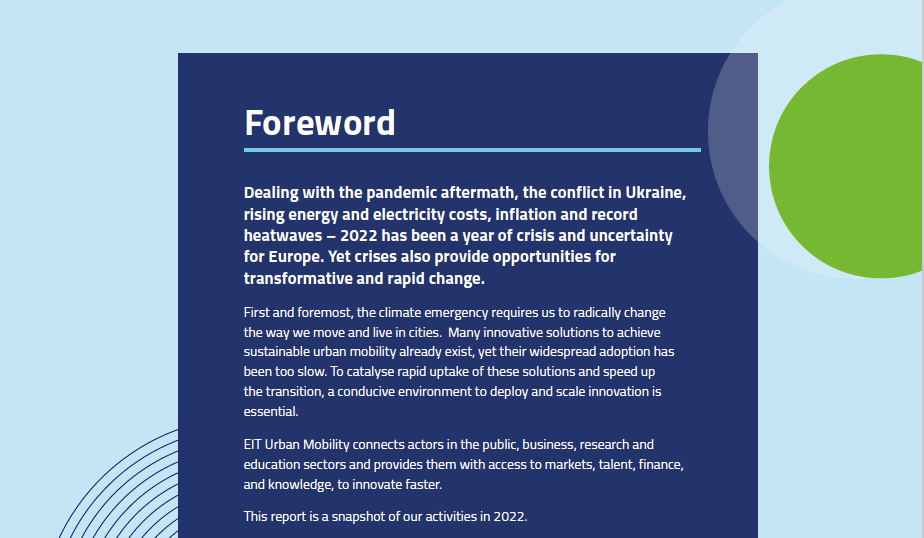
I recently helped a European urban mobility organization produce a range of corporate communication materials.
One task involved writing the main pages for an annual report to showcase major achievements.
In the absence of an updated strategic agenda or communications strategy, I needed to understand the organization's mission, vision, and priorities to draft the introductory pages. I was also tasked with writing the company narrative, text for the corporate leaflet and the main slide deck for pitching to potential new members and partners. So the same key messaging and mission and vision statements had to be included in all the materials to ensure consistency. They were not tasks that could be done quickly or easily as senior management first needed to agree on what those were.
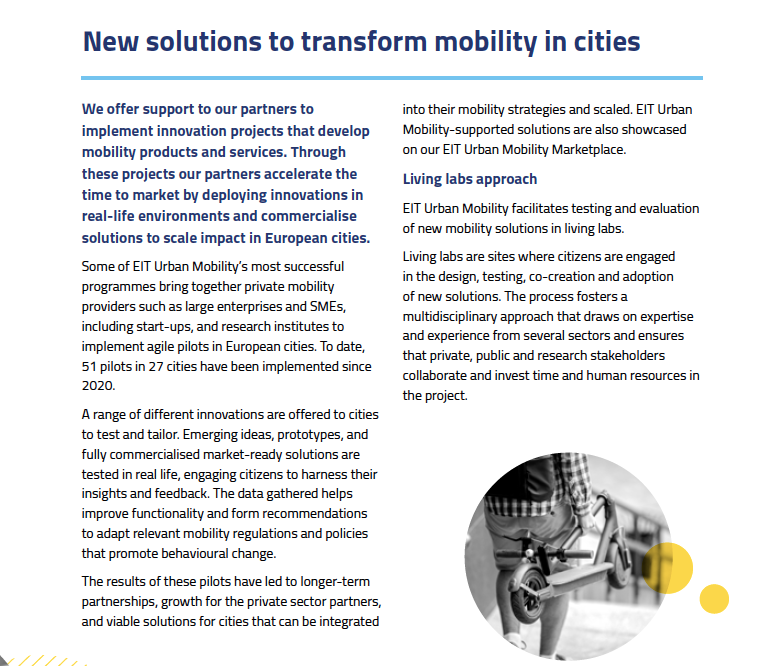
I held interviews with Directors and managers to try and get a clearer idea of what their departments did, how they worked together and with external stakeholders, what they thought the company should focus on, and how it should achieve those goals.
Several rounds of edits and multiple conversations resulted in a final draft of the report and leaflet – just in time to be printed and distributed at their flagship event.
The report also required different skills. Apart from structuring the content and writing it up, I had to synthesize a large amount of information, weave together several disparate threads, fact-check various claims, figures, dates, names and sources, and edit and proofread project summaries. Most of the latter had been done earlier in the year, but some projects were still winding up.
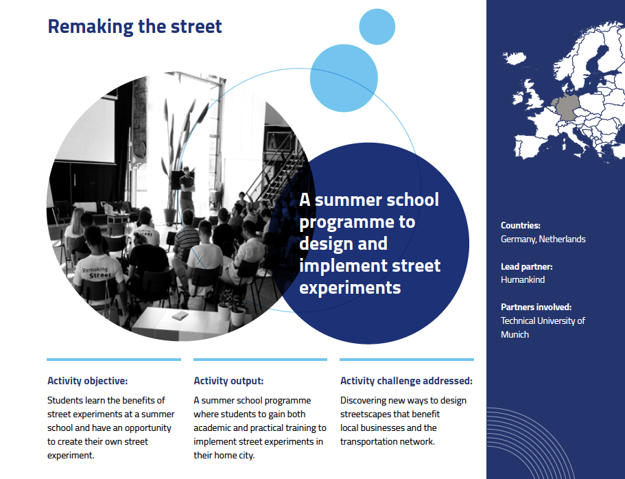
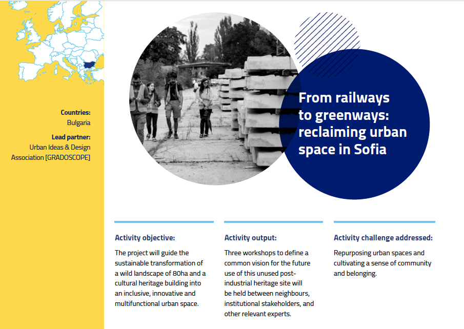
As a company co-funded by the EU, I had to find a middle road between clear, succinct text and including some technical jargon, which was recommended based on conversations with colleagues and stakeholders.
Style guide
Additionally, I wrote the company's first style guide to set the tone of voice, give tips on common grammar, punctuation and expression mistakes, and a brief rundown of the differences between American and British English particularly regarding mobility and transport terms.
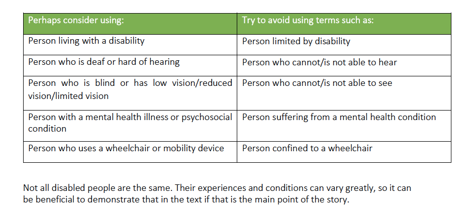
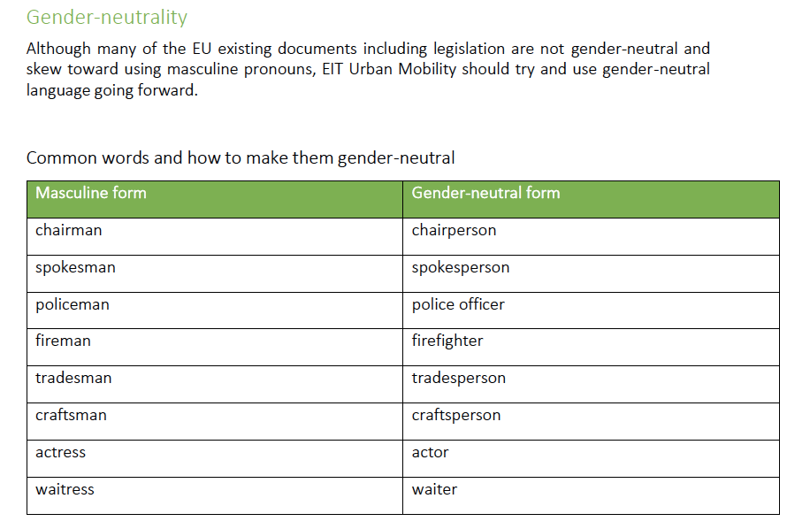
I also wrote a section on inclusive language which outlined how to write in regards to gender, age, race, religion and faith, disability/ability and sexual orientation. I earmarked how to be aware of bias and communicate in different cultural settings.
Language is alive, so style guides should be updated to reflect an organization's values. I think the language used attracts like-minded stakeholders and potential employees. It can set you apart from similar brands and your competitors in a positive way.
Visual identity
I work with designers to create brand and visual identities. These guidelines specify how to use color palettes for digital and print publications (CMYK, Hex Codes, etc), type and placement of logos, visual elements for brand consistency, heading and text sizes and fonts, use of logos and slogans/taglines, and more.
Thinking about the values and mission of a company can help shape a concept brief for the designer to start from. If the main idea to convey is trust and credibility in a formal way, blue is often used for large, government or authoritative institutions. A more youthful or fun brand might consider yellow, orange or pink and cartoon-like visuals; while nature-focused companies may opt for a mix of green, terracotta and blue to represent trees/grass, earth and the sky.
A visual identity can also specify the kind of audience it wants to target by reflecting those kinds of people in images and graphics. People are more prone to trust a brand if they see themselves portrayed in a positive way as opposed to stereotypical representations.


